All the material on display in the exhibition, i.e. matrices and pamphlets, “bulletins” and posters can be read in the time span from the mid-nineteenth century to the year 2000 through paper, .
Various types of paper used can be distinguished. As technologies evolve, certain types of paper slowly disappear to make way for new types. New printing presses want other qualities of paper. This is where the very smooth coated papers come in, due to the coating of kaolin that is spread over the surface of the paper unrolled from the reel. This type of paper is perfect for typography, which requires mainly smooth papers, even if it can deteriorate over time if kept in damp environments. The so-called half-fine papers will therefore disappear. A type of paper used for multi-copy blocks.
Half-fine papers are smoothed mechanically. The surface of the two sides passes under a calender, a steel cylinder, polished to a mirror finish and heated internally until the outer surface of this cylinder reaches 70° centigrade. Up to and including chemical papers instead of carbon paper. This paper will lead to the disappearance of the medium used until then for multi-copy blocks. Alternating each sheet with a sheet of carbon paper.
Among the prints found in the archives, the most dated is a 50-page pamphlet from 1869: Settennario in Onore della BEATA MARGARITA da Città di Castello. Dedicated to the Ill.ma Sig. Contessa, Marianna Della Porta nata Berioli. The movable type used is Bodoni and Garamond.
Until 1979, all typography work was carried out with movable type, which employed two or three out of five typesetters. Until the 1980s, Grifani Donati employed five typesetters, three bookbinders, one of whom was my wife Adriana, and three machinists who, if necessary, also worked as pressmen at the Elia dell’Orto press.
Through the covers of the “Bollettini” you can see the evolution of the graphics following the style in vogue at the time. From Art Nouveau to the simplicity of the 1930s. Many zinc clichés were designed by local artists and reproduced in matrix. I was able to recognise two Nativity scenes, designed by my brother Corrado, in two clichés.
It is interesting to note that this type of matrix is also used for other purposes. This has been the case since the dawn of letterpress printing. The woodcuts, the clichés of Gutenberg’s time, were reproduced on other printed matter. Corrado’s clichés would later be used for Christmas cards. In the 1980s we print with off-set printing. The techniques change but not the relationship with the Institute. With Mother Superior Sister Tiberia Ciribilli the Institute acquired a new dynamism. Sister Tiberia’s request to print the bulletin in colour was a challenge that fascinated me. From now until the last issues it has been printed in colour using off-set.
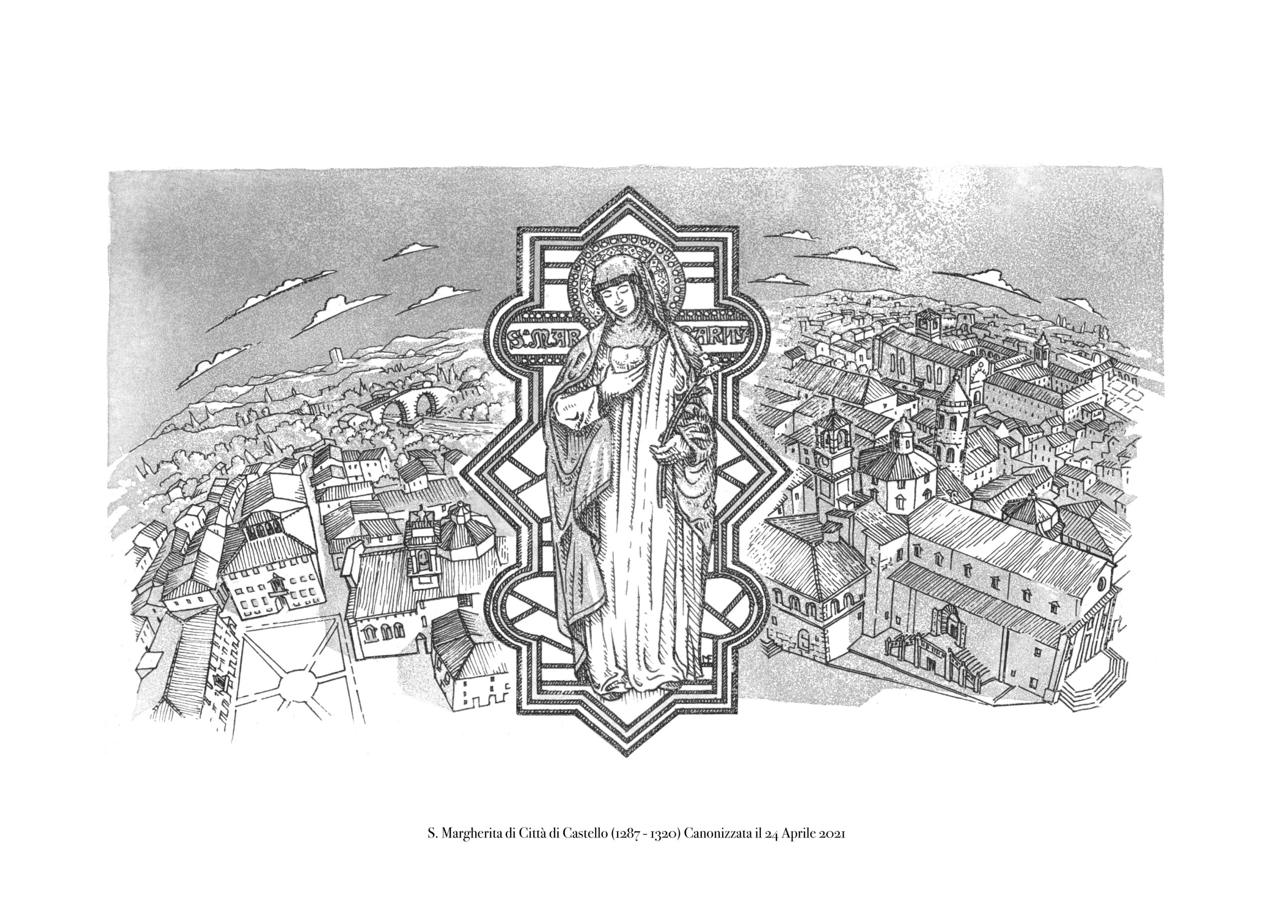
Memories of Blessed Margaret
My memories of Blessed Margaret are quite clear.
The first time I saw her was with my grandmother Veronica together with two childhood friends, Nicoletta and Brunella. San Domenico was packed that day, people were all over the street. We held hands and disappeared in single file behind the altar to reappear to her left. I remember the face. The receding skin of his face revealed his teeth. It did not frighten me, only made me curious. Nicoletta and Brunella were not shocked either.
What struck me was how small she was. I met the Institute for the Blind “Beata Margherita” with my grandmother Bettina. She gave lace-making lessons to Sister Ernesta and then to the blind women who were the object of my curiosity; I was amazed and could not understand how they managed to find the right spool among those spools.
Later, when I was about 10 years old, I discovered that they also had other unimaginable abilities: they even acted. There was a theatre in the institute where they gave regular performances. I watched them fascinated. Their closed eyes tended to look down. Their facial expressions were a bit fixed, their body expressions active but aware of the space around them.
As I grew up, I got to know more and more about the Institute, its places and the people who lived there, from the kitchen to the crypt where the venerated remains of Blessed Margaret were kept. I would take the proofs of the “Bulletin” to the Mother Superior, she would make corrections and after a week or two she would bring them back to the printer with the corrected proofs. In the course of time, I knew three of them.
The work was done by three or four composers. Each one was entrusted with his own composition. Some did the backgrounds, some the headlines, some the eyelets. In 1979, I started to print it myself, in four colours with a Rotaprint. In the same year, the Institute became a Torball team, founded by Daniela Bambini, a physical education teacher, and other willing women.
Daniela, whom we contacted for this occasion, provided us with a testimony of that fantastic period, sending us a complete and compelling account, now on display in the premises of the Printing House.nThe material on view was chosen by highlighting the various activities carried out by the Institute.
This exhibition is now on display in the rooms that my grandparents, Bettina and Alberto, lived in until 1950, and before that (until 1400) were the rooms of the Abbess of the Monastery.
Giovanni Ottaviani
Displayed in the notice boards
the “Bulletins” containing photographs of personalities from Tifernati or abroad: such as the sculptor, Duke Luca and Paola di Liegi. Reproduced in zinc clichés or offset plates.
Galvanotypes and friezes in lead alloy (lead, tin and antimony) clichés and monograms.
Covers from the 1930s designed by Borri, up to those printed in the 1980s with an off-set machine, the Rioby 35×50.
Enjoy your visit!
Translated with www.DeepL.com/Translator (free version)